Control App Redesign
Overview
An internal engineering tool was about to reach external users. I led its redesign under a tight timeline, restructuring navigation and bringing it onto the design system, while setting up a new dev team to keep building on their own.
Focus
Design System
Accessibility
Year
2026
Read
4 min
Status


Overview of the redesigned interface: optimized information architecture with full alignment with the design system.
◆
The context
Overview
Control App is a web interface for controlling and monitoring power converters. It began as an internal tool, built by the engineering team without a designer, where making it work mattered more than making it usable. It had never touched the design system, because it never needed to.
That changed when the business decided to open it to external users. They would use it across roles and workflows, on-site from a laptop being just one. A rough internal tool suddenly had to work for far more people than it was built for. It also didn't stand alone. Control App sat inside a wider ecosystem of tools: some it would absorb, some it would replace, some it had to keep working alongside. Part of the job was designing one app while making sense of the system around it.
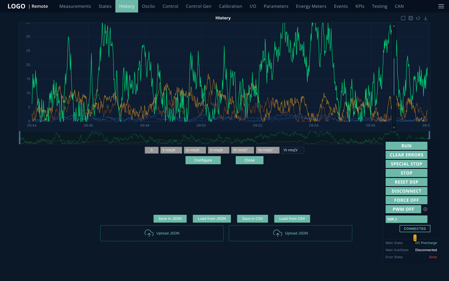
Legacy view before redesign: dense information layout, unaligned with the design system.
◆
Leading the redesign
Process & collaboration
The work started with a kickoff with the PM and PO, and the mandate had two halves: open the tool to external users, and understand the full set of workflows behind it. I structured the work to do both at once. Development got an early foundation to build on, while research and a deeper audit ran in parallel and kept feeding the design.
◆
1
Framing and rapid audit
PM
PO
The kickoff set the two goals. A PM interview and a rapid heuristic audit gave me a first read on who used the tool and where it was breaking: broken hierarchy, accessibility gaps, and a UI sitting entirely outside the design system. This was also where we planned the research: internal users first, external users once we had more context.
Deliverables:
Heuristic audit, Research plan
◆
2
A skeleton to unblock development
Design intern
Dev team
PO
Development couldn’t wait, so I gave it a foundation. With a design intern I was mentoring, I built the first screen to a design-system baseline, new colors, type, and navigation, so the team could start straight away. We showed it to the team, onboarded them to Figma, and began iterating the navigation together.
Deliverables:
First screen, Design-system baseline, Figma onboarding
◆
3
Discovery and the full audit
PM
Internal users
Domain experts
Design intern
With the skeleton unblocking the devs, I ran discovery with internal users to understand the real workflows. That context was what made a thorough audit possible: only once I understood how people actually worked could I map every problem and decide what to reorganize. Card sorting with domain experts then turned that understanding into a navigation grounded in how people group their work.
Deliverables:
Discovery findings, Card sort, Navigation IA
◆
4
Scaling and handoff
Dev team
PM
From here I ran two tracks at once: deeper discovery into specific workflows and users, and a full handoff for the dev team, documented components, prioritization, and onboarding, with new use cases being built alongside. By the time I rotated off, the team had a solid base and plenty of finished screens to keep shipping on their own.
Deliverables:
Documented components, Handoff process, Service blueprint
Iterations
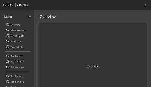
The heuristic audit revealed critical accessibility gaps and a chaotic structure of 13+ flat tabs. Working closely with the PO the wider product team, and the design intern, we iterated through concepts to solve these visibility issues. A massive backend overhaul was impossible under strict technical deadlines, so we pivoted away from a scalable sidebar. The hybrid grouped top-nav became the feasible fix, balancing accessible grouping with the realities of the development schedule.

Legacy
Legacy flat tabs
Rejected
Scalable sidebar

Selected
Grouped top-nav
◆
What shipped
Outcome & trade-offs
Tight timelines meant hard prioritization. Here is what made it in, and what I consciously left for later.
Delivered
Rebuilt navigation & IA: Replaced 13 flat tabs with a grouped structure and moved floating controls to a dedicated toolbar, creating a consistent layout.
Design system compliance: The app met the company’s baseline design and accessibility standards for the first time, establishing a solid foundation for scale.
Developer onboarding: Delivered documented components and a clear handoff process, giving the engineering team everything needed to build independently.
System blueprint: Provided a visual overview of the entire process to give the team broader context, guiding ongoing architectural detailing.
Future plans
External User Research: Postponed to a later phase due to strict delivery deadlines and shifting project rotations.
Deep Workflow Polish: Prioritized critical user paths, leaving the deeper redesign of edge-case flows for future iterations.
◆
Impact
1
Continuity
The dev team came out onboarded and already building alongside me, with documented components and a handoff that let them carry the redesign forward after I rotated off.
2
Readiness
The tool now meets the design-system and accessibility standards it needed before going external, with several core workflows redesigned .
3
Clarity
A vague, urgent brief became a grouped navigation, a mapped product picture, and a plan the team could keep scaling from.
◆
What I took from it
This project ran on constraints: no full discovery up front, a new team, an urgent deadline. That made the design work inseparable from leading it. Starting before the picture was complete, keeping development moving, and getting a new team fluent in the design system.
What stuck with me is that the highest-leverage thing I did was not drawing screens. It was creating enough order and direction for everyone else to build well without me. A lot of senior design is quiet work that clears the way for other people.