Adaptive Dashboards
Overview
An existing dashboard tool was pushing analysts toward external ones. I led its redesign from research through delivery, extending it with signal search, unified controls, and saved views, with the biggest gains in how analysts find and plot data.
Focus
Research
Data visualization
Year
2025
Read
5 min
Status
Under NDA

Mockup: Dashboards tab overview
◆
The problem
Overview
Teams remotely monitor renewable energy systems to diagnose complex issues across massive fleets. The platform provided basic dashboards, but they lacked the flexibility these expert workflows required.
Customization was superficial. Basic layouts existed, but the features felt underdeveloped and rigid. We knew the tool wasn’t serving the analysts well, but the root causes were unclear.
The initial brief was simply to “improve the custom dashboard.” Because the actual pain points were so vague, I knew we couldn’t just jump straight into a UI redesign. We had to step back and uncover how these teams were actually doing their jobs.
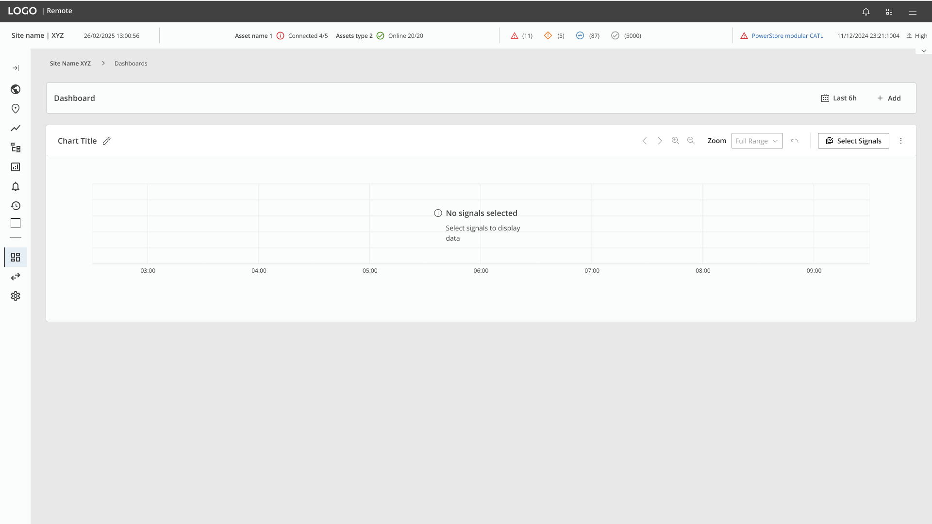
Legacy state
◆
Finding the real problem
Research & scoping
The discovery
To ground the project in reality, I conducted semi-structured, in-depth interviews with four system specialists, mapping their daily workflows to identify missing functionalities.
The research revealed a significant friction point: finding and comparing signals within deeply nested asset hierarchies was overly complex. This friction disrupted workflows, forcing analysts into highly inefficient processes just to complete their analysis.

User flow mapping
Prioritization & alignment
Research surfaced more to fix than we could take on at once. I ranked the opportunities by impact and feasibility and aligned the team on where to start, so we led with the improvement that mattered most.

User stories and prioritization matrix
Delivering the solution
Post-research, it was clear we couldn't build everything at once. We prioritized a roadmap focused on keeping users engaged and eliminating the need for external tools.
We tackled three immediate focus areas, with the Signal Selection redesign being the most complex and high-impact challenge—which is why it's the focus of this case study.

1
Selecting signals
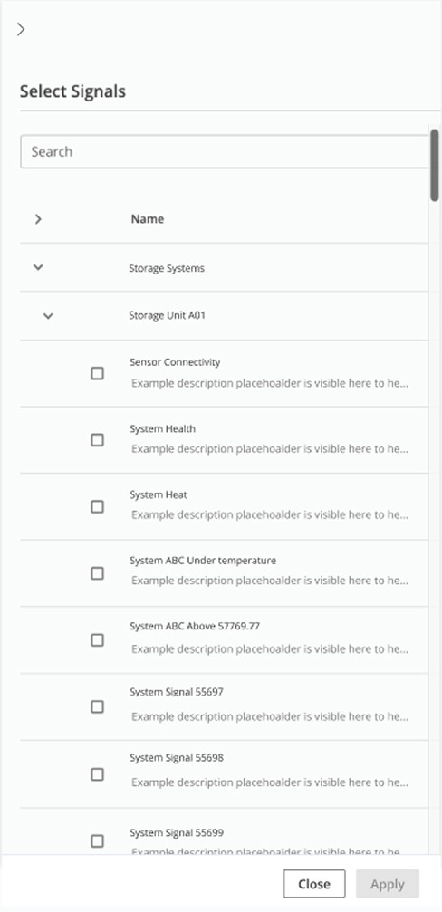
Navigating deeply nested asset trees was tedious. I designed a custom, search-driven tree view so analysts can instantly find and select the exact data streams they need.
2
Unified controls
Analysts were repeating the same manual adjustments across multiple charts. I decoupled global settings from individual charts so parameters, like timeframes, now synchronize instantly, eliminating repetitive work.
3
Dashboard saving
Recreating complex layouts daily was inefficient. I designed a straightforward saving mechanism allowing analysts to independently build, name, and revisit their specific workflows.
◆
Deep dive: Selecting signals
This was the heart of the challenge. The legacy interface couldn’t properly support navigation across massive asset trees, which slowed down critical analysis.
To solve this, I designed the selection panel around search-driven navigation and a clear hierarchy. Because the standard design-system component couldn’t handle this data density, I engineered a custom solution featuring robust filtering, visual icons, and expand/collapse controls.
Analysts can now efficiently filter, search, and navigate the data structure to find exactly what they need, plotting signals in seconds without the previous limitations


◆
Impact
◆
What I took from it
Discovery created the options, but the impact came from prioritization. Anchoring the work around search, structure, and selection let the dashboards scale without breaking design-system consistency.
Two lessons stuck: scope strategy belongs inside the design process, not just the roadmap, and design systems have to evolve to handle high-density, edge-case workflows.